I figured I could give a brief update and some more details about the work that is happening here at ML HQ.
According to the posted PLAN, we are currently at: March + April : "New" Mobile View
So what does that entail, why am I doing this, and what is happening?
During a recent trip, I had to access the game primarily from my phone for some days. And honestly, I found the experience to be too annoying.
We also know that we have a lot of stability-problems with the APP, specially on iPhones, and this is a big problem for those who primarily use their phones to play ML.
I won't go into the APP-problems here, that is a long story and hard to fix, but I am certain I can make many improvements to the "web-interface" when accessing the game with a phone.
The main problems, as I see them, can be boiled down to a few items:
- The menu is obviously too small on the screen, and misclicks happen all the time.
- Everything else is also too small on the screen, and you need to zoom in and out like a madman to do anything.
- Popups have their own issues, opening up "off screen", and get in the way all the time. They are also much to small ofc.
- A lot of buttons / icons are too close and too small, adding to frequent mis-clicks.
- The usage of screen-realestate is messed up, with the game trying to fit the narrow design, which is 860 by 1315. And when trying to fit that fixed size onto a mobile screen, yeah, most phones are left with a big black box at the bottom.
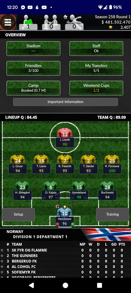
Here are 4 screenshots from my own phone, illustrating some of these problems:
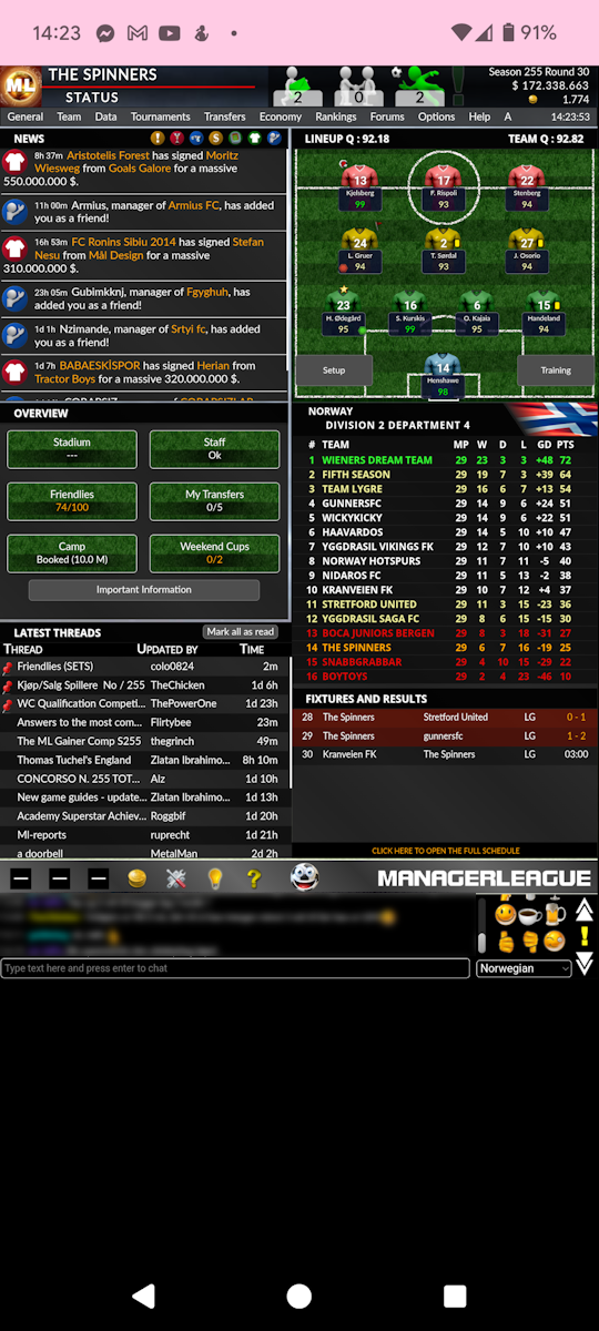
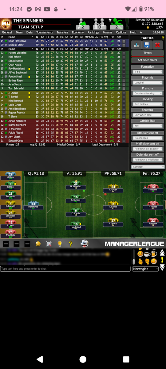
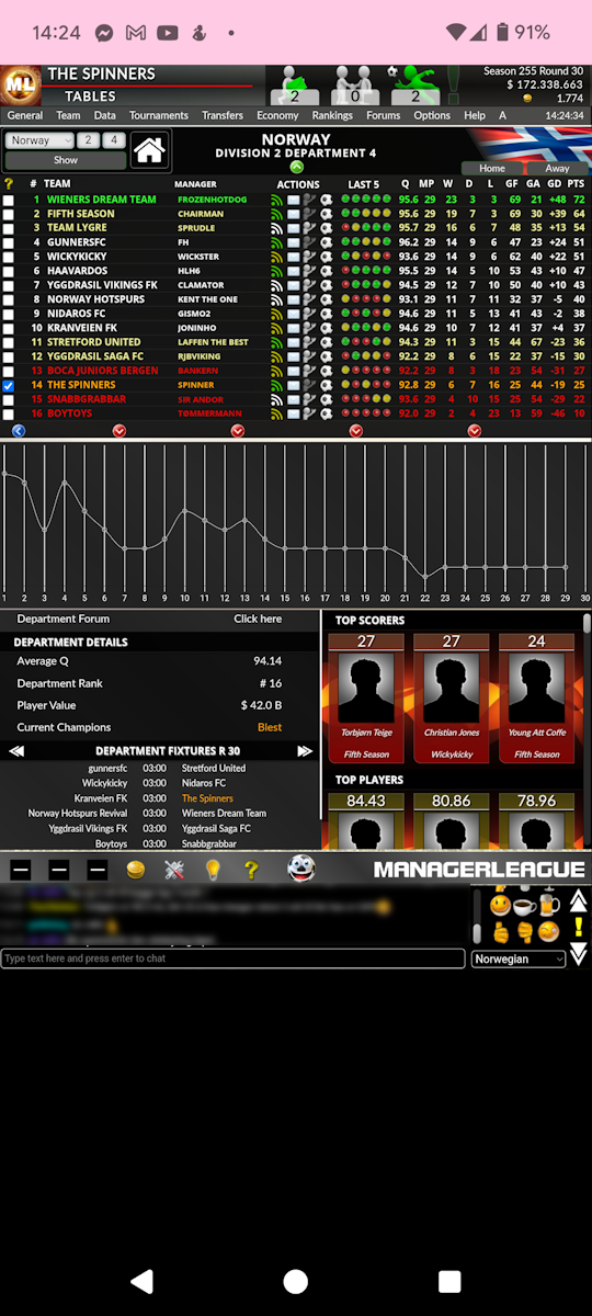
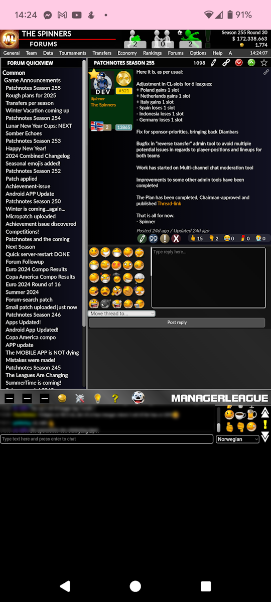
ML has about 47 different "sections" or "views". In addition there are 2 popups that are pretty crowded and frequently used (players and teams). There is also one special "screen", the match-player, which is very demanding. But I have made good progress so far this month.
Here are the two first screenshots, in their new "design".
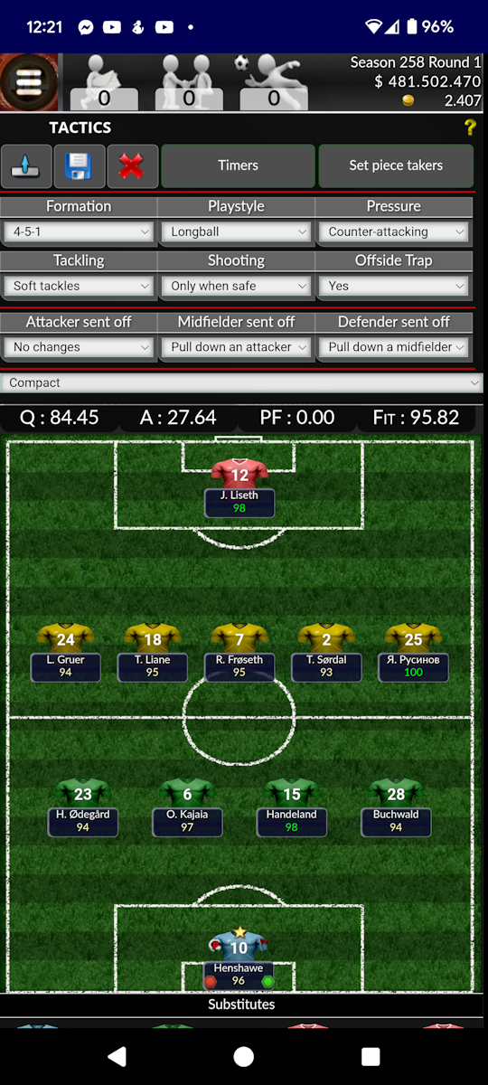
Notice how the text, the names and everything else is actually readable :)
The main menu is also "gone", replaced by a "Hamburger-menu-button" in the top left.
Also notice how the screen is no longer capped to fit a certain height, but is allowed to be as "tall" as it needs to be, as scrolling / swiping on the phone is something we do all the time easily. No worries, the chat is still down there at the bottom ;)
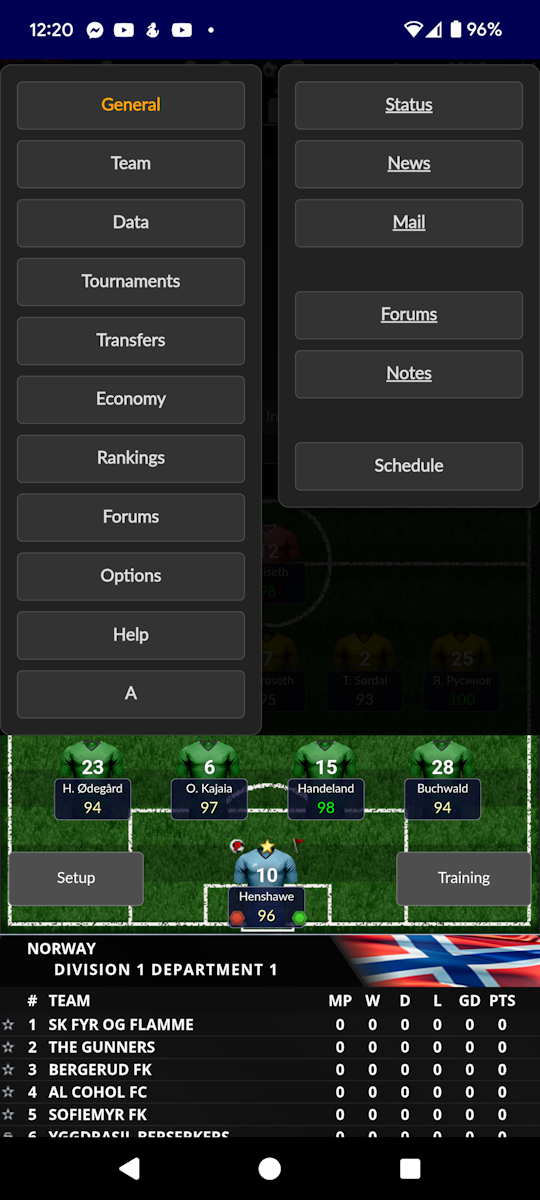
The menu has been allowed to take up a big part of the screen when opened, so it should be "fat finger tolerant". Hopefully it is self-explanatory, but here is what it looks like:
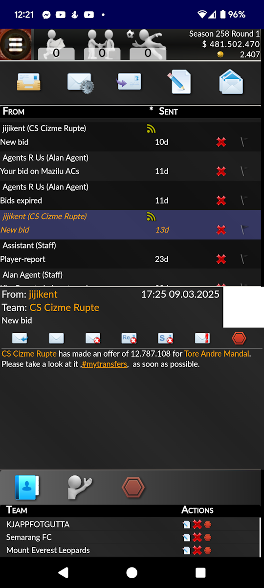
I have also made an effort trying to make Messages and Forums more mobile-friendly, and here is the result so far:
So this is what I am doing these days, going over every single section, every popup, the match-player, identifying specific problems and try to fix them for small screens.
In some cases, "a box" just requires a few lines of CSS to change to the desired size. Other times I need to alter the rendering leetcode too, which can be a lot more work, and risk breaking the other widths we support.
I am also taking special care to make sure the popups are always visible on the screen, and don't open too far up or down (out of sight).
So now you know what I have done for the last weeks, and what I will continue to work on for the next month. I HOPE to finish on time, and I think I will. I am sure there will be an update in the forums when the time comes ;)
- Spinner